What are SF Symbols
During WWDC 2019, Apple introduced a free set of over 1,500 symbols to be used by developers in their applications. Here I will explain how to use the new Apple SF Symbols in your applications. In any case, even if they are free, you must take into account the license agreements indicated by Apple:
All SF Symbols shall be considered to be system-provided images as defined in the Xcode and Apple SDKs license agreements and are subject to the terms and conditions set forth therein. You may not use SF Symbols — or glyphs that are substantially or confusingly similar — in your app icons, logos, or any other trademark-related use. Apple reserves the right to review and, in its sole discretion, require modification or discontinuance of use of any Symbol used in violation of the foregoing restrictions, and you agree to promptly comply with any such request.
Obtain SF Symbols
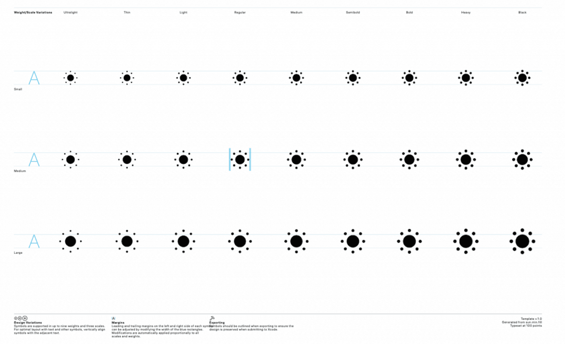
As we have said, the SF Symbols are a set of more than 1500 icons, integrated in the San Francisco text font and that are configurable for all types of size and weight.
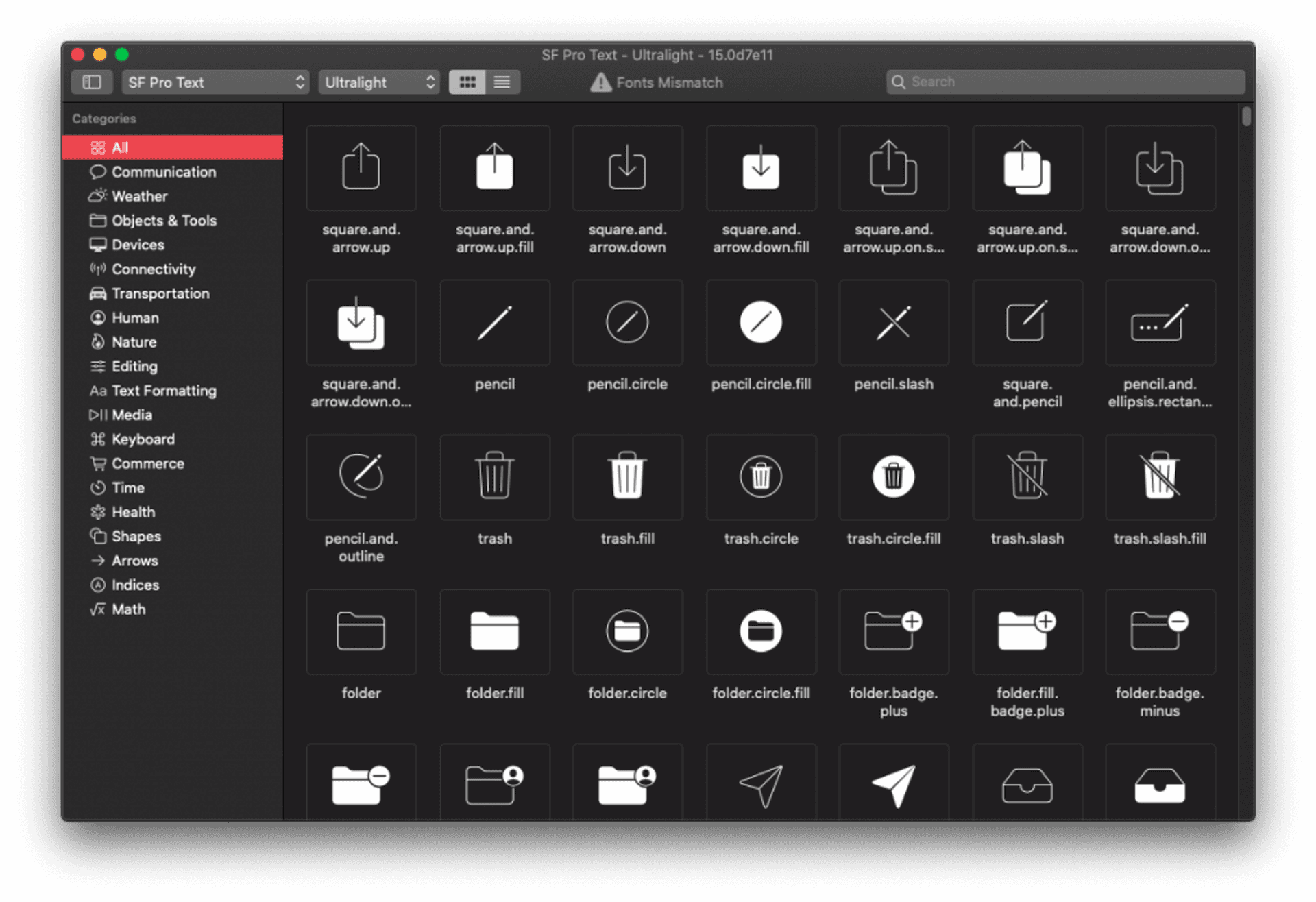
In order to know what icons are available, we can download an Apple application. This app is available for macOS 10.14 and later.
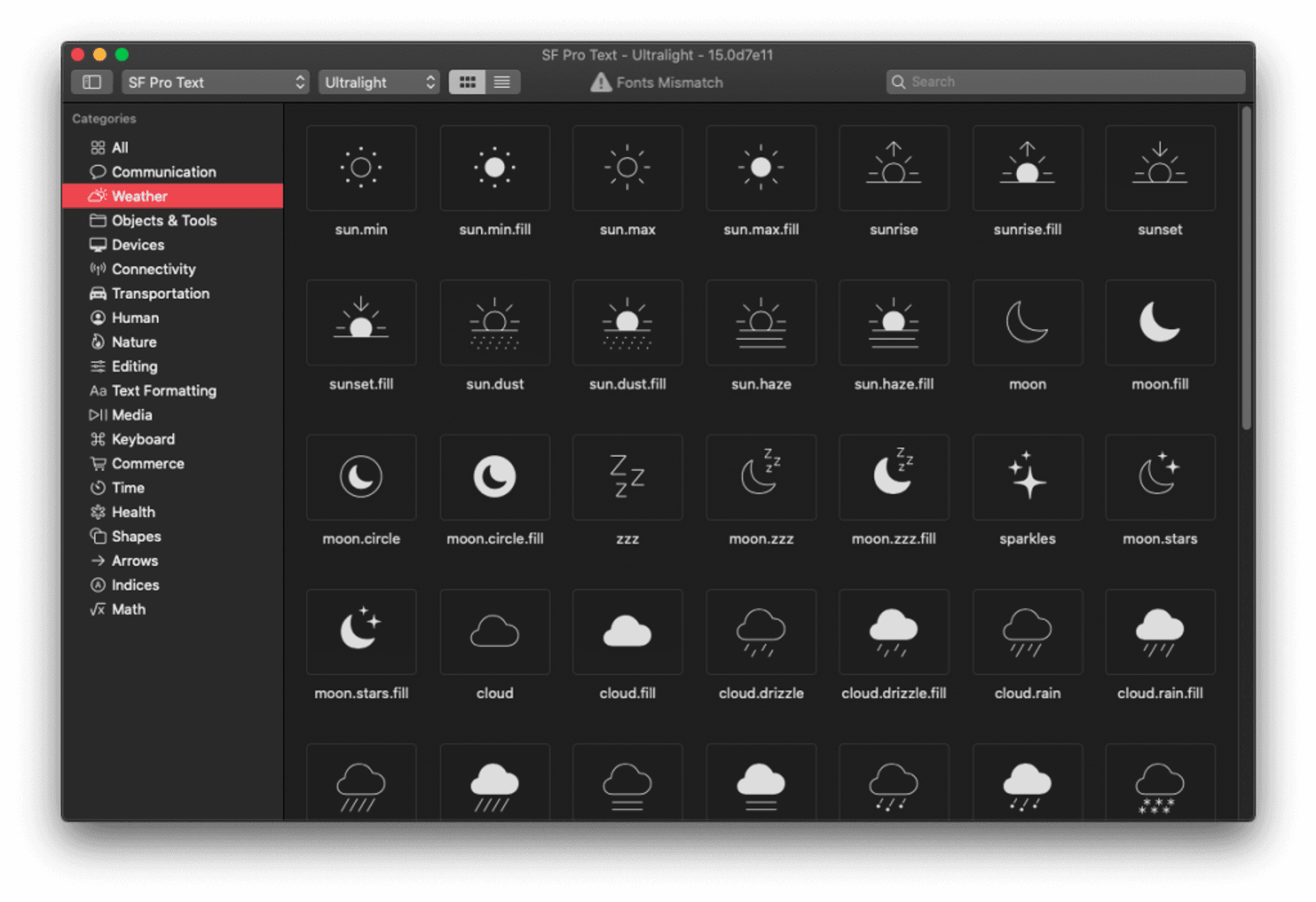
With this application we can show icons both by weight (in the previous image the icons with ultralight weight were shown), or by theme. Thus, if we select Weather in the left column, we will see all the icons related to this theme.
Support
SF Symbols can be used on the following platforms:
- iOS 13 and later
- watchOS 6 and later
- tvOS 13 and later
Export, modify and validate SF Symbols
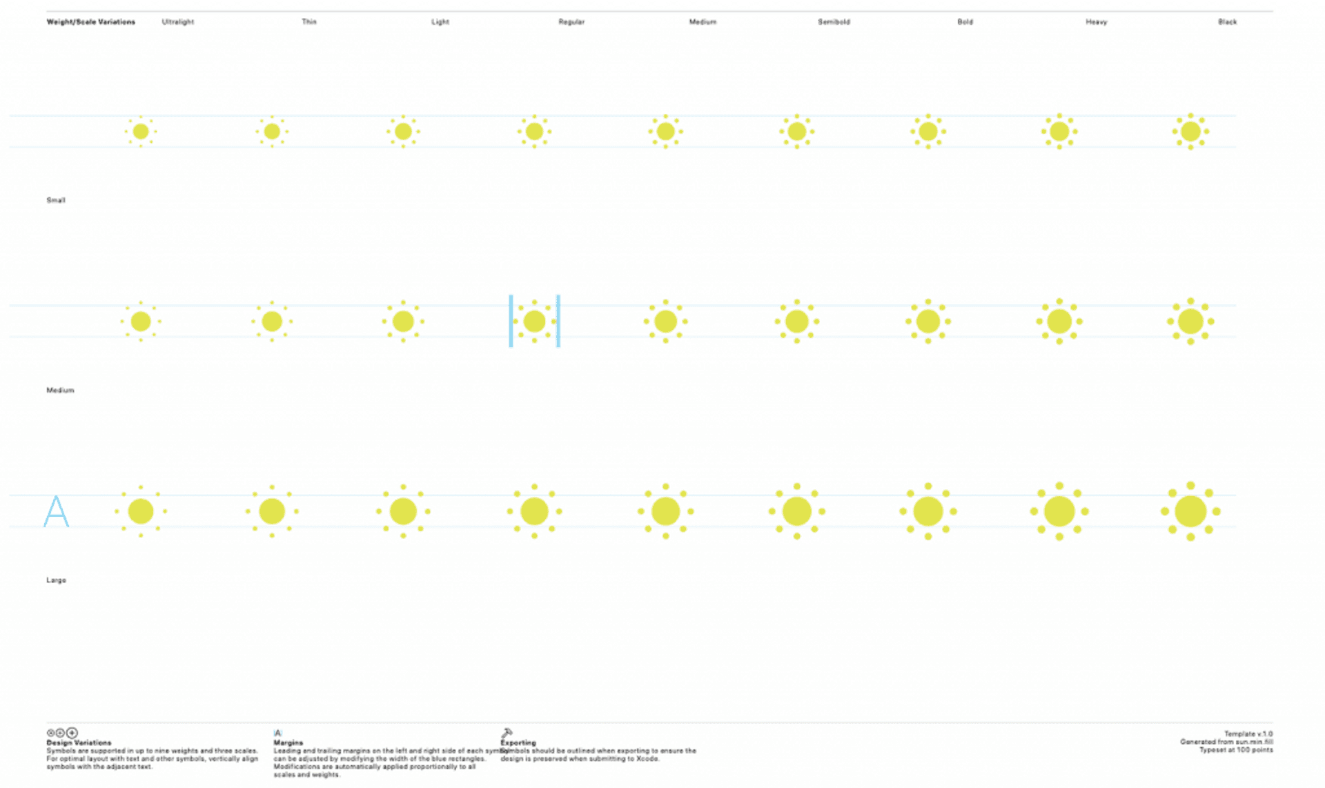
SF Symbols can also be exported from the application, simply select the symbol you want to export and from the top menu, select File > Export Custom Symbol Template… or type ⌘E. With this we will obtain the icon in SVG format.
Once we have exported the icon we can modify it through another program, in this case we will change the color of the icon from black to yellow.
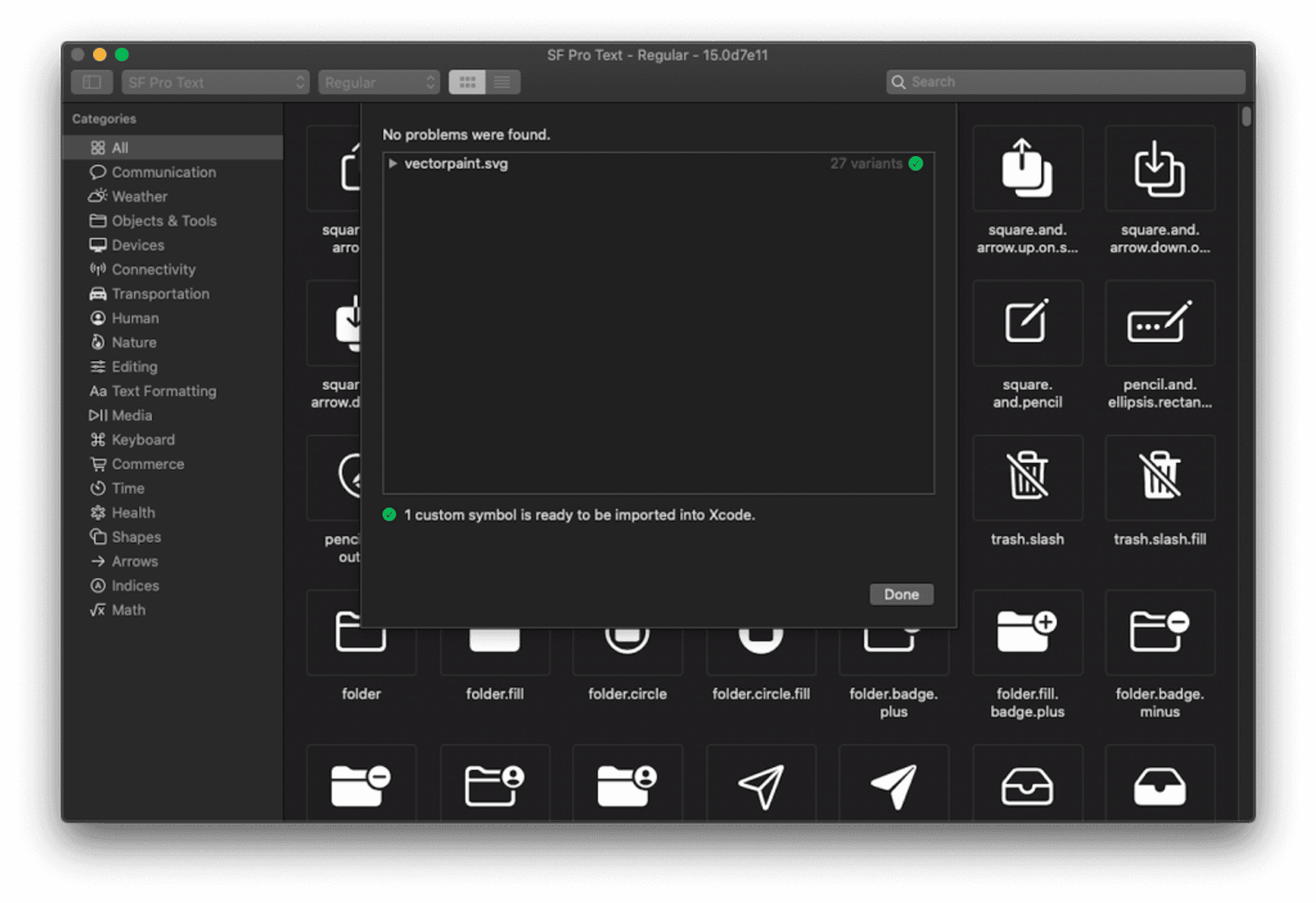
Next, we have to check if the modifications made are valid. To do this, from the SF Symbols application we go to File > Validate Custom Symbols…, select the .svg file of the modified icon and validate it.
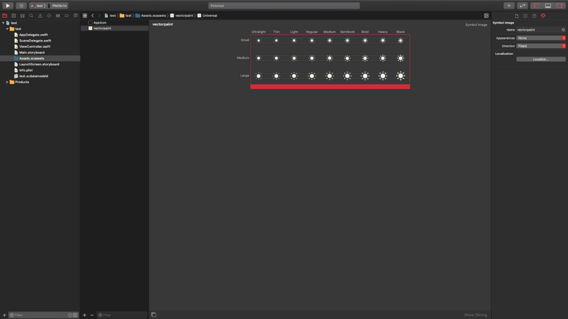
Once this is done, we can go to an Xcode project, select the Assets folder and drag the .svg file inside. Now we can use it.
How to use SF Symbols in our projects
Using SF Symbols in iOS 12
SF Symbols can only be used natively in iOS 13. So how can we use them in previous versions like iOS 12?
If we want to use any of these symbols in versions prior to iOS 13, what we must do is export that symbol (as we have seen before) and, using some graphic tool, transform it into png format (for example) and import it into the Assets.xcassets catalog of the project.
Using SF Symbols in iOS 13 and SwiftUI
Using SF Symbols with SwiftUI is very simple, we simply have to add an Image component with the name of the symbol that we want to show:
Image(systemName: "sun.min.fill")Once we have the symbol, we can modify its size and color in different ways, for example:
Image (systemName: "sun.min.fill")
     // resize
     .font (.system (size: 40.0))

     // Change in size and weight
     .font (.system (size: 40.0, weight: .light))

     // Change in size, weight and style
     .font (.system (size: 40.0, weight: .light, design: .monospaced))

     // Resize based on text style
     .font (.system (.headline))

     // Change in size and weight depending on the style of the text
     .font (.system (.headline) .bold ())

     // Change the icon scale
     .imageScale (.samll)

     // Change the icon color
     .foregroundColor (.yellow)

     // Change the accent color of the icon
     .accentColor (.orange)
Using SF Symbols in iOS 13 and UIKit
If we want to use an SF Symbol in a project with iOS 13, but working with UIKit instead of SwiftUI, we have two options: create it with code or in a storyboard.
Code
To use these symbols in Swift, call them in a UIImage component using the systemName parameter instead of named:
let symbol = UIImage(systemName: "sun.min.fill")Now, if we want to configure its appearance as we have done in the case of SwiftUI, we must use the SymbolConfiguration class of UIImage:
let configuration = UIImage.SymbolConfiguration(pointSize: 40.0)
let symbol = UIImage(systemName: "sun.min.fill", withConfiguration: configuration)
If we look, as we enter the code to generate the configuration, we see that there are numerous initializers for said configuration.
In this way we can configure different parameters of the appearance of the symbol, such as:
// size
let configuration = UIImage.SymbolConfiguration (pointSize: 40.0)

// Size and weight
let configuration = UIImage.SymbolConfiguration (pointSize: 40.0, weight: .light)

// Weight
let configuration = UIImage.SymbolConfiguration (weight: .light)

// Font and scale
let configuration = UIImage.SymbolConfiguration (font: .systemFont (ofSize: 40.0), scale: .medium)

// Source
let configuration = UIImage.SymbolConfiguration (font: .systemFont (ofSize: 40.0))

// Text style
let symbconfigurationolConfig3 = UIImage.SymbolConfiguration (textStyle: .headline)
Storyboards o .xib files
In the case of using Storyboards or .xib files, the use of SF Symbols is simple:
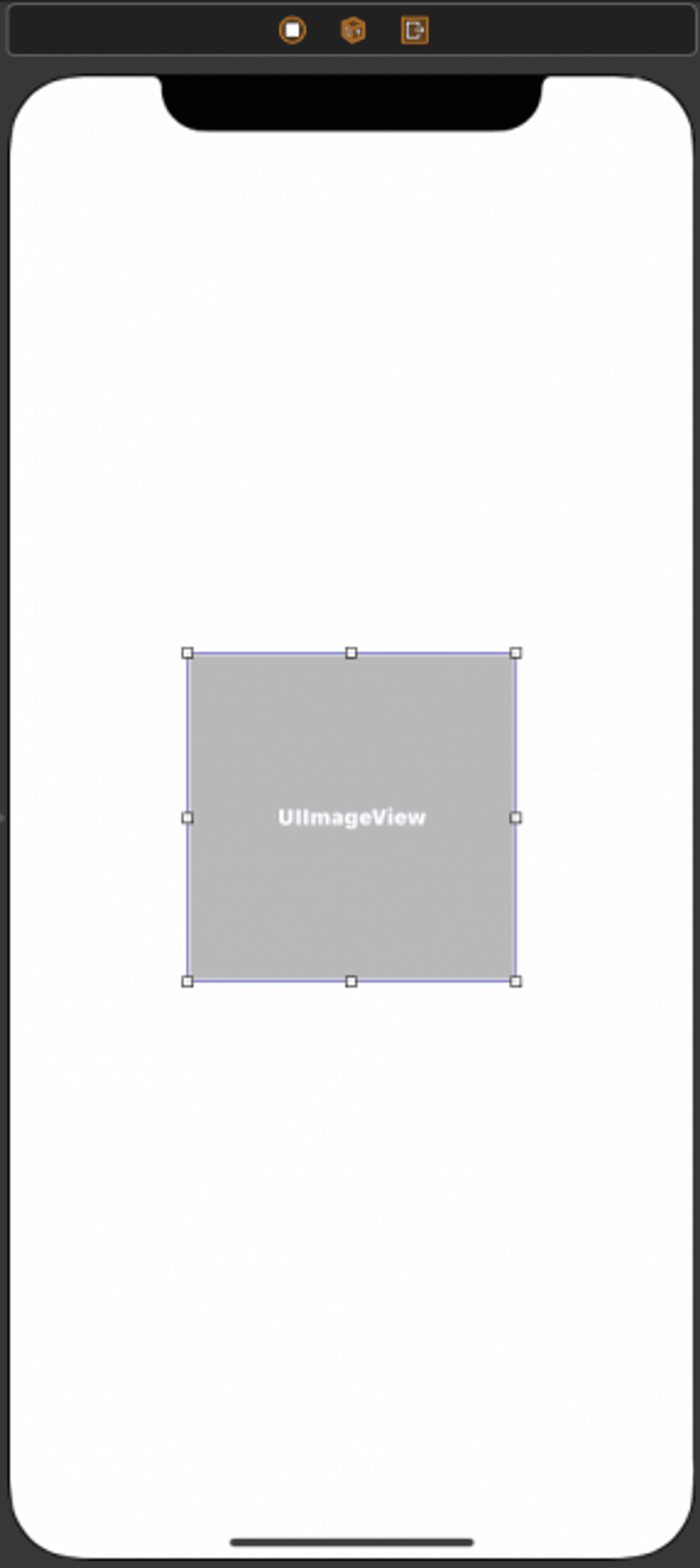
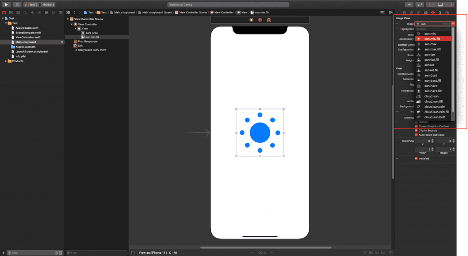
We drag a UIImageView component onto the view:
Next, in the Attributes Inspector, we select the symbol that we want to show (a menu appears with the available symbols):
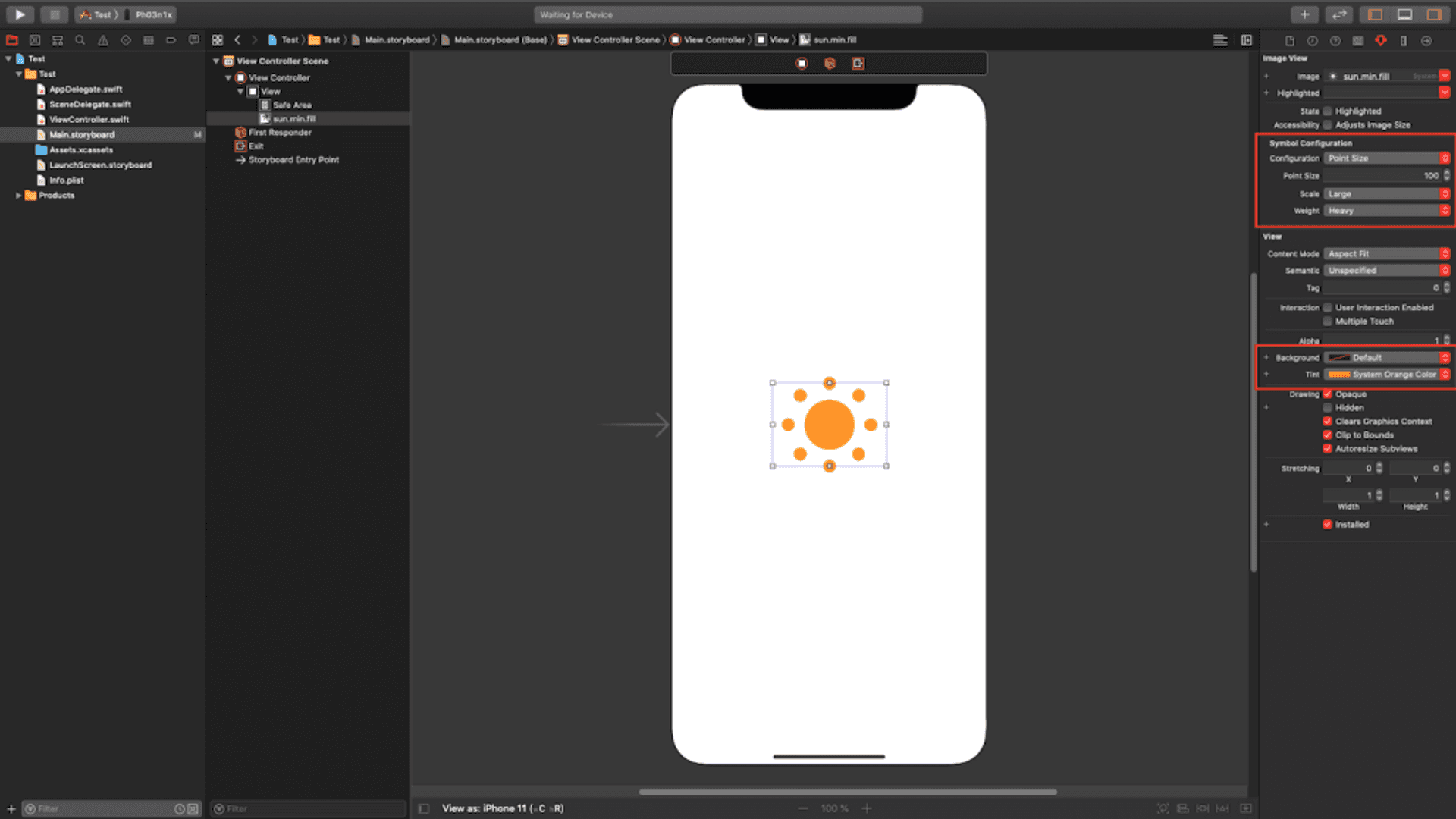
Finally, we modify the attributes of the symbol (size, weight, scale, color …):
Specific cases in iOS 12: UIImageView and UIButton
In addition to adding a symbol setting when creating a UIImage element, there are two new cases where this setting can be applied: UIImageView and UIButton.
This can be done from a new property that these elements present: preferredSymbolConfiguration in the case of UIImageView and setPreferredSymbolConfiguration(_:forImageIn:) in the case of UIButton.
These properties allow us to configure an image, for example, to resemble the text around it.
// UIImageView
let symbol = UIImage(systemName: "sun.min.fill")
let imageView = UIImageView(image: symbol)
let configuration = UIImage.SymbolConfiguration(weight: .light)
imageView.preferredSymbolConfiguration = updatedConfiguration

// UIButton
let symbol = UIImage(systemName: "sun.min.fill")
let button = UIButton()
button.setImage(symbol, for: .normal)
let configuration = UIImage.SymbolConfiguration(weight: .light)
button.setPreferredSymbolConfiguration(configuration, forImageIn: .normal)
Conclusion
Thanks to the more than 1500 SF Symbols that Apple presented during WWDC 2019, and that we can use for free, we can develop applications faster with a professional finish.
