Create a Floating Action Button for Swift Package Manager
Creating a Floating Action Button
Surely you have seen some applications in which there is a button that, when pressed, displays a menu with other buttons (which we could call secondary). The main button, is usually called FAB or Float Action Button. In this article we are going to see how we can create a Floating Action Button with Swift, which when pressed, displays (with an animation) a menu, and how to share it through Swift Package Manager.
The use of Swift Package Manager will allow us to share it and include it as a dependency in different applications.
The code for this article can be found on GitHub. Keep in mind there may be some modifications in the repository code compared to the one described here, since new functionalities can be added, others can be improved and small errors can be corrected.
## Swift Package Creation (for Swift Package Manager)
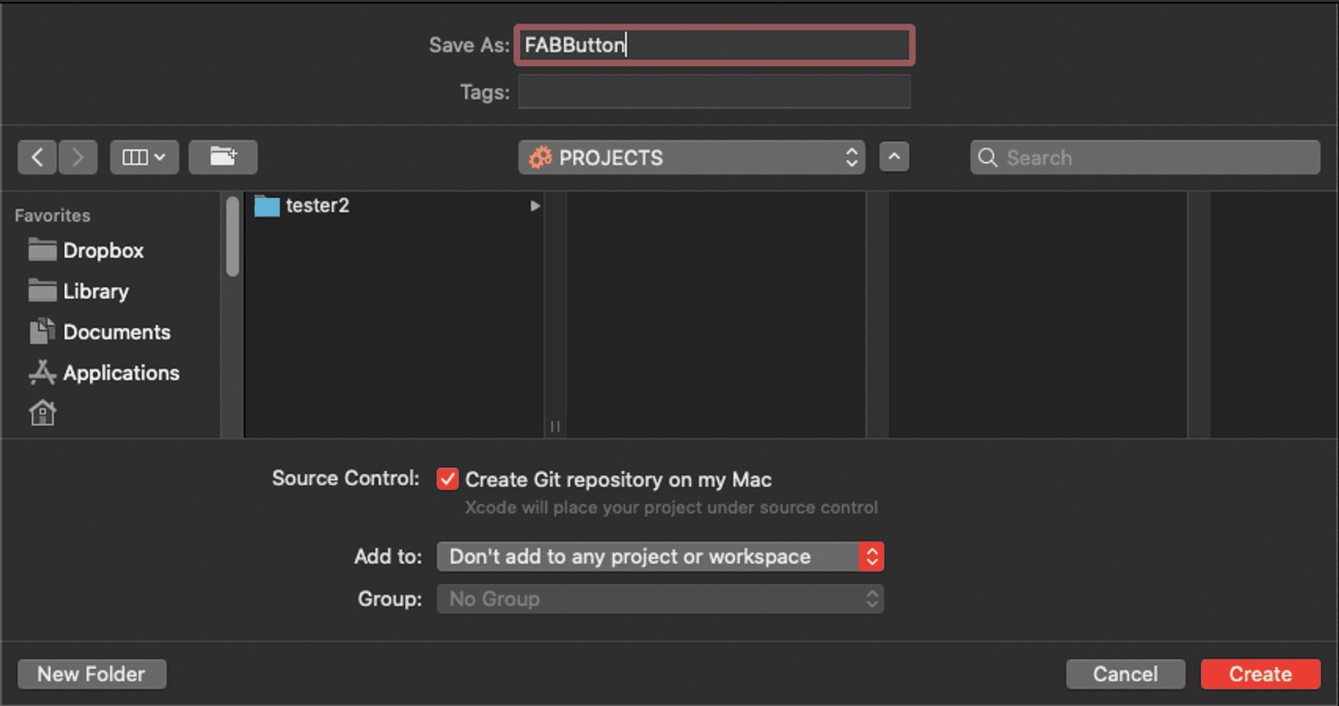
First we create the Swift package. To do this, from the Xcode menu we follow the New > Swift Package path and give it the name of FABButton (remember to activate version control, Create Git repository on my Mac, to be able to upload it later to a repository on the network).
We will define this project to be used on iOS10+ platforms. We will indicate this in the Package.swift file (as explained in a previous article):
import PackageDescription

let package = Package(
    name: "FABButton",
    platforms: [
        .iOS(.v10)
    ],
    products: [
        // Products define the executables and libraries produced by a package, and make them visible to other packages.
        .library(
            name: "FABButton",
            targets: ["FABButton"]),
    ],
    dependencies: [
        // Dependencies declare other packages that this package depends on.
        // .package(url: /* package url */, from: "1.0.0"),
    ],
    targets: [
        // Targets are the basic building blocks of a package. A target can define a module or a test suite.
        // Targets can depend on other targets in this package, and on products in packages which this package depends on.
        .target(
            name: "FABButton",
            dependencies: []),
        .testTarget(
            name: "FABButtonTests",
            dependencies: ["FABButton"]),
    ]
)
Component design
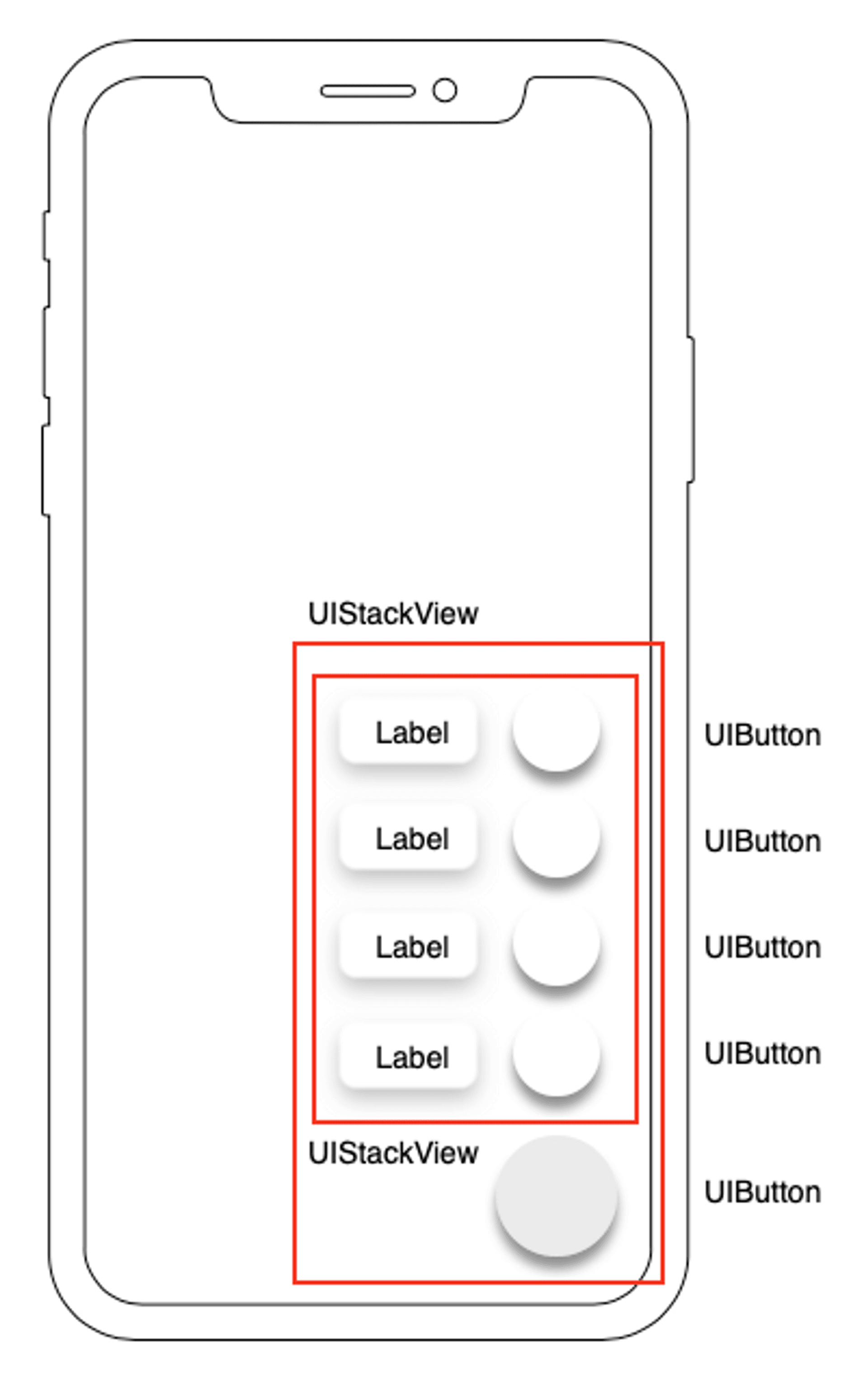
The component design will be as follows:
The main view is made up of a UIStackView component, which will contain the main button (UIButton component) and a second UIStackView component, which will be the one containing the secondary buttons, each of which will be labeled (with a UILabel component). The fact of using UIStackView components is due both to its ability to distribute the elements it contains and to adapt to its content.
Main view development
The main view is created in the Sources/FABButton directory with the name FABView. Initially, in this view we will define and place the components that make it up: the main button and the UIStackView component that will contain the secondary buttons.
import UIKit

public class FABView: UIStackView {

    private let stackView = UIStackView(frame: .zero)
    private var mainButton = UIButton(frame: .zero)

    public init(buttonImage: UIImage?) {
        super.init(frame: .zero)

        mainButton.setImage(buttonImage, for: .normal)
        mainButton.addTarget(self, action: #selector(mainButtonAction), for: .touchUpInside)
        configure()
    }


    required init(coder: NSCoder) {
        fatalError("init(coder:) has not been implemented")
    }


    private func configure() {
        configureContainer()
        layoutUI()
    }


    private func configureContainer() {
        translatesAutoresizingMaskIntoConstraints = false
        distribution = .fill
        axis = .vertical
        alignment = .trailing
        spacing = 16
        clipsToBounds = true
        stackView.delegate = self
    }


    @objc private func mainButtonAction() {


    }


    private func layoutUI() {
        addArrangedSubview(stackView)
        addArrangedSubview(mainButton)

        NSLayoutConstraint.activate([
            mainButton.trailingAnchor.constraint(equalTo: trailingAnchor),
            mainButton.bottomAnchor.constraint(equalTo: bottomAnchor),
            mainButton.widthAnchor.constraint(equalToConstant: 50),
            mainButton.heightAnchor.constraint(equalToConstant: 50),

            stackView.trailingAnchor.constraint(equalTo: trailingAnchor),
            stackView.topAnchor.constraint(equalTo: topAnchor),
            stackView.widthAnchor.constraint(equalToConstant: 150)
        ])
    }
}
In this code we have done the following:
- First we instantiate a UIButton component and a UIStackView component.
- Then we establish a custom initializer to indicate the image of the main button:
public init(buttonImage: UIImage?) {
    super.init(frame: .zero)

    mainButton.setImage(buttonImage, for: .normal)
    mainButton.addTarget(self, action: #selector(mainButtonAction), for: .touchUpInside)
    configure()
}
In the same way as the FABStackView class, we also declare this initializer as public, to be able to access it once we import it as a dependency. Inside the initializer we establish the image of the button and associate its target (mainButtonAction). Then we call the configure() method, which will be the one that configures the different components and places them in the view:
private func configure() {
    configureContainer()
    layoutUI()
}


private func configureContainer() {
    translatesAutoresizingMaskIntoConstraints = false
    distribution = .fill
    axis = .vertical
    alignment = .trailing
    spacing = 16
    clipsToBounds = true
}


@objc private func mainButtonAction() {


}

private func layoutUI() {
    addArrangedSubview(stackView)
    addArrangedSubview(mainButton)

    NSLayoutConstraint.activate([
        mainButton.trailingAnchor.constraint(equalTo: trailingAnchor),
        mainButton.bottomAnchor.constraint(equalTo: bottomAnchor),
        mainButton.widthAnchor.constraint(equalToConstant: 50),
        mainButton.heightAnchor.constraint(equalToConstant: 50),

        stackView.trailingAnchor.constraint(equalTo: trailingAnchor),
        stackView.topAnchor.constraint(equalTo: topAnchor),
        stackView.widthAnchor.constraint(equalToConstant: 150)
    ])
}
In the configuration of the UIStackView component, we have indicated that the elements (secondary buttons) that it contains are arranged vertically, align to the right (trailing), fill all the space (the UIStackView component will grow when you add buttons) and that there is a separation of 16).
Main button configuration
The main button we have created, mainButton, is a simple square button with an image inside. To make it look like a Floating Action Button we have to make it round and shaded.
For this, what we will do is create a subclass of UIButton with the characteristics that we want to give the button. What we do is:
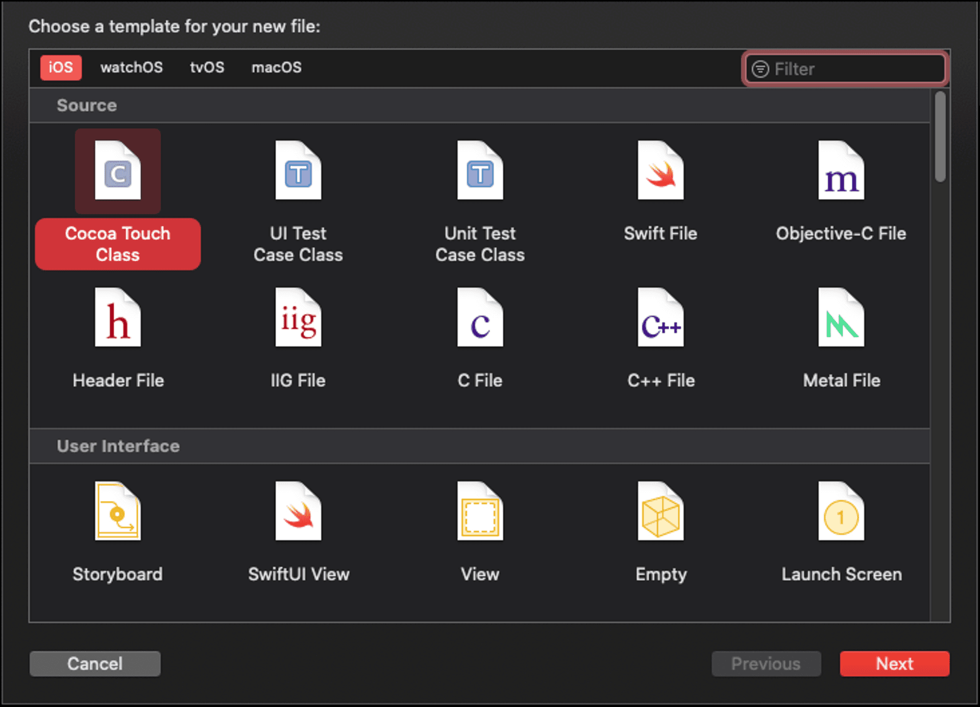
- From the Xcode menu we create a new file (File > New > File…) and select Cocoa Touch Class.
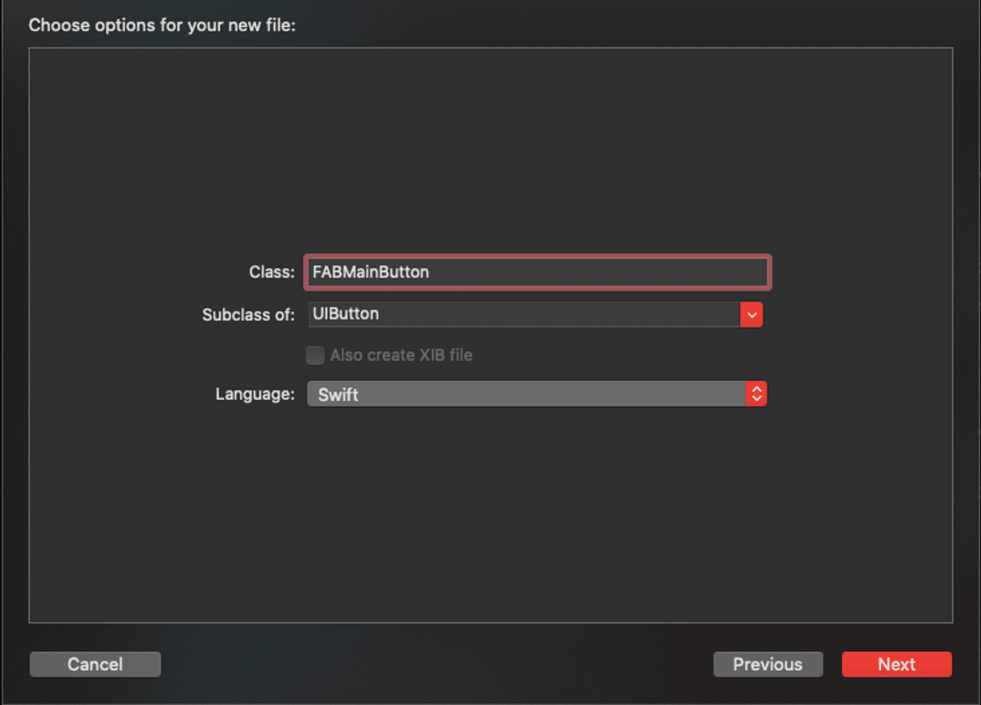
- When the options window for the new file appears (Choose options for your new file:), we indicate the name of the FABMainButton file, which will be a subclass of UIButton:
- By default, the code that appears in this class is:
import UIKit

class FABMainButton: UIButton {

    /*
    // Only override draw() if you perform custom drawing.
    // An empty implementation adversely affects performance during animation.
    override func draw(_ rect: CGRect) {
        // Drawing code
    }
    */

}- First we will add the initializers:
override init(frame: CGRect) {
    super.init(frame: .zero)
    configure()
}


required init?(coder: NSCoder) {
    fatalError("init(coder:) has not been implemented")
}
At the end of the init method the configure() method is called, which will be where we will customize the button.
private func configure() {
    translatesAutoresizingMaskIntoConstraints = false
    backgroundColor = UIColor.white
    layer.cornerRadius = 25
    dropButtonShadow()
}
As you can see, what we do is give the button background a white color, make it round by indicating that the radius of the corners is 25 (half the size of the button, which is 50) and, as we are using auto layout, we indicate that translatesAutoresizingMaskIntoConstraints = false.
At the end of this method the method that will create the button shadow is called:
private func dropButtonShadow() {
    layer.shadowColor = UIColor.black.cgColor
    layer.shadowOffset = CGSize(width: 0.0, height: 0.0)
    layer.shadowRadius = 5.0
    layer.shadowOpacity = 0.5
    layer.cornerRadius = 25.0
}
Once this subclass of UIButton is created, we go to the FABView class and change the way we have installed the main button, from:
private var mainButton = UIButton(frame: .zero)To:
private var mainButton = FABMainButton(frame: .zero)Creating the secondary buttons
The menu components consist of a button (with a personalized image) and a label with the button’s identifier. To create these components we will use a UIView subclass in which we will define the button and the label.
- From the Xcode menu we create a new file (File > New > File…) and select Cocoa Touch Class (as we have done with the FABMainButton component).
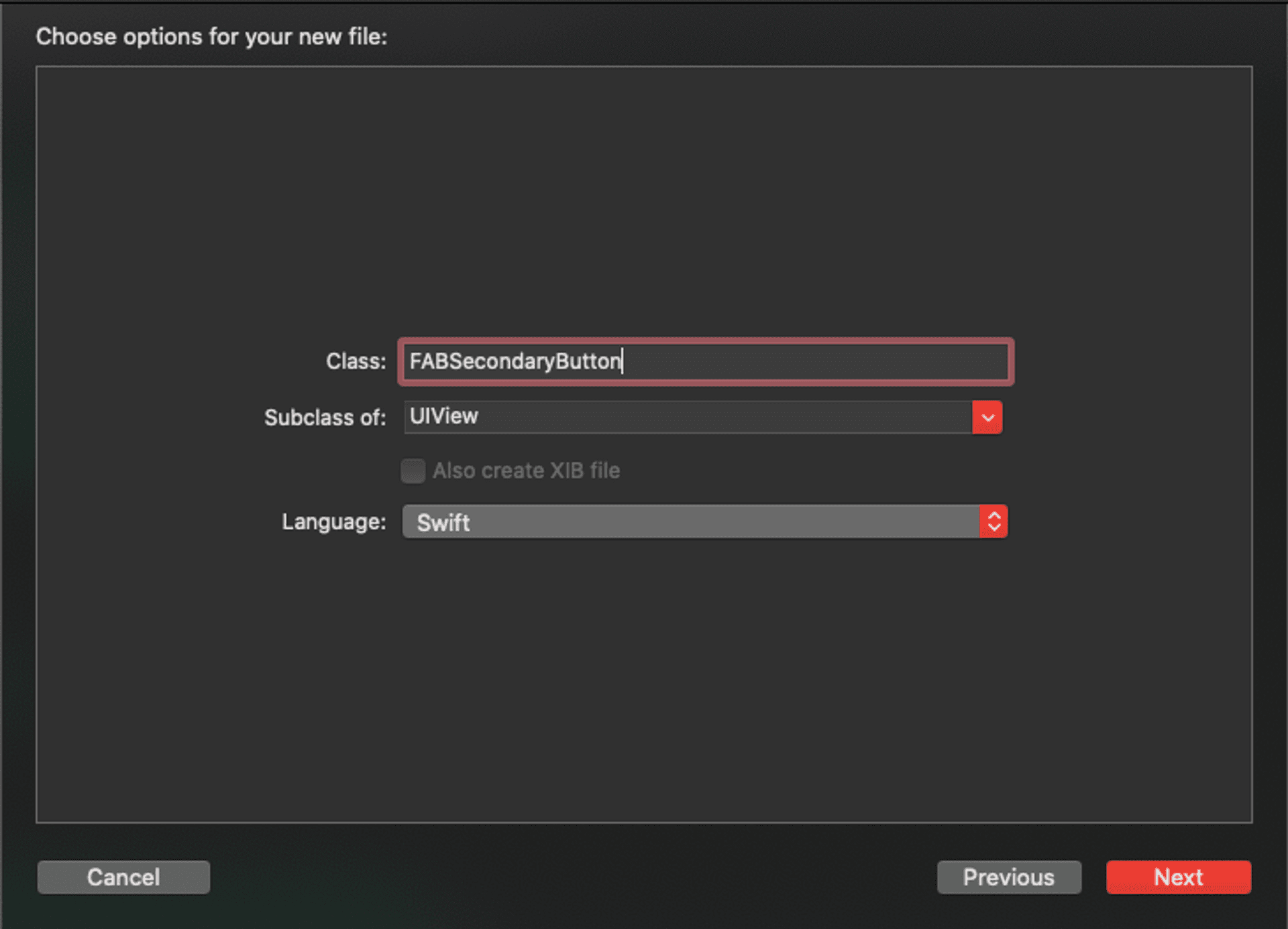
- When the options window for the new file appears (Choose options for your new file: ), we indicate the name of the file FABSecondaryButton, which will be a subclass of UIView:
By default, the code that appears in this class is:
import UIKit

class FABSecondaryView: UIStackView {

    /*
    // Only override draw() if you perform custom drawing.
    // An empty implementation adversely affects performance during animation.
    override func draw(_ rect: CGRect) {
        // Drawing code
    }
    */

}
Initially we create a UIButton component, a UILabel component and a UIView component on which we will place the UILabel component (and that will allow us to give the shadow effect to the label):
private var secondaryButton = UIButton(frame: .zero)
private var buttonLabel = FABInsetLabel(frame: .zero)
private var labelView = UIView(frame: .zero)

override init(frame: CGRect) {
    super.init(frame: .zero)
    configure()
}


required init?(coder: NSCoder) {
    fatalError("init(coder:) has not been implemented")
}


private func configure() {
    configureSecondaryButton()
    configureLabel()
    configureLayoutUI()
}


private func configureSecondaryButton() {
    secondaryButton.translatesAutoresizingMaskIntoConstraints = false
    secondaryButton.setImage(<IMAGE>, for: .normal)
    secondaryButton.backgroundColor = UIColor.white
    secondaryButton.layer.cornerRadius = 17
    secondaryButton.addTarget(self, action: #selector(secondaryButtonAction), for: .touchUpInside)

    dropShadowToView(secondaryButton)
}


@objc private func secondaryButtonAction() {

}


private func configureLabel() {
    labelView.backgroundColor = .white
    labelView.translatesAutoresizingMaskIntoConstraints = false
    labelView.layer.cornerRadius = 4
    dropShadowToView(labelView)

    buttonLabel.translatesAutoresizingMaskIntoConstraints = false
    buttonLabel.font = .systemFont(ofSize: 11)
    buttonLabel.textAlignment = .center
    buttonLabel.text = <TITLE>
    buttonLabel.textColor = .gray
    buttonLabel.contentInsets = UIEdgeInsets(top: 0, left: 7, bottom: 0, right: 7)
}


private func configureLayoutUI() {
    translatesAutoresizingMaskIntoConstraints = false
    addSubview(labelView)
    labelView.addSubview(buttonLabel)
    addSubview(secondaryButton)

    NSLayoutConstraint.activate([
        secondaryButton.centerYAnchor.constraint(equalTo: centerYAnchor),
        secondaryButton.trailingAnchor.constraint(equalTo: trailingAnchor, constant: -9),
        secondaryButton.widthAnchor.constraint(equalToConstant: 34),
        secondaryButton.heightAnchor.constraint(equalToConstant: 34),

        labelView.centerYAnchor.constraint(equalTo: centerYAnchor),
        labelView.leadingAnchor.constraint(equalTo: buttonLabel.leadingAnchor),
        labelView.trailingAnchor.constraint(equalTo: secondaryButton.leadingAnchor, constant: -12),
        labelView.heightAnchor.constraint(equalToConstant: 27),

        buttonLabel.trailingAnchor.constraint(equalTo: labelView.trailingAnchor),
        buttonLabel.topAnchor.constraint(equalTo: labelView.topAnchor),
        buttonLabel.bottomAnchor.constraint(equalTo: labelView.bottomAnchor),
    ])
}


private func dropShadowToView(_ view: UIView) {
    view.layer.shadowColor = UIColor.gray.cgColor
    view.layer.shadowOffset = CGSize(width: 0.0, height: 1.0)
    view.layer.shadowRadius = 4.0
    view.layer.shadowOpacity = 0.4
}
To make the labels adapt to the width of their content, but including a certain margin, instead of using the UILabel component directly, we make a subclass of this (which we call FABInsetLabel). In this subclass, what we do is modify the width of the label adding a certain value that we can specify:
import UIKit

class FABInsetLabel: UILabel {

    var contentInsets = UIEdgeInsets.zero

    override func drawText(in rect: CGRect) {
        let insetRect = rect.inset(by: contentInsets)
        super.drawText(in: insetRect)
    }


    override var intrinsicContentSize: CGSize {
        return addInsets(to: super.intrinsicContentSize)
    }


    override func sizeThatFits(_ size: CGSize) -> CGSize {
        return addInsets(to: super.sizeThatFits(size))
    }


    private func addInsets(to size: CGSize) -> CGSize {
        let width = size.width + contentInsets.left + contentInsets.right
        let height = size.height + contentInsets.top + contentInsets.bottom
        return CGSize(width: width, height: height)
    }
}
As pressing the secondary button should produce an action, we will establish a protocol to pass the action and a delegate within the class:
public protocol FABSecondaryButtonDelegate: class {
    func secondaryActionForButton(_ action: @escaping () -> ())
}

weak var delegate: FABSecondaryButtonDelegate?
In addition, we will create a custom initializer that allows us to pass the image of the button, the text of the label and the action to be performed. To simplify all these parameters, we will use typealias to unify these parameters and instantiate a variable with this type:
typealias FABSecondary = (title: String, image: UIImage, action: () -> ())

private var fabSecondary: FABSecondary!

init(fabSecondary: FABSecondary) {
    super.init(frame: .zero)
    self.fabSecondary = fabSecondary
    configure()
}
Now we can complete the class that we have created, which will be as follows (the parts that we had previously prepared have been simplified):
import UIKit

public protocol FABSecondaryButtonDelegate: class {
    func secondaryActionForButton(_ action: FABSecondaryAction)
}

public typealias FABSecondaryAction = () -> ()

typealias FABSecondary = (title: String, image: UIImage, action: () -> ())

class FABSecondaryButton: UIView {

    ...

    private var fabSecondary: FABSecondary!

    weak var delegate: FABSecondaryButtonDelegate?

    override init(frame: CGRect) {
        ...
    }

    init(fabSecondary: FABSecondary) {
         super.init(frame: .zero)
         self.fabSecondary = fabSecondary
         configure()
    }


    required init?(coder: NSCoder) {
        ...
    }


    private func configure() {
        ...
    }


    private func configureSecondaryButton() {
        ...
    }


    @objc private func secondaryButtonAction() {
        delegate?.secondaryActionForButton(fabSecondary.action)
    }


    private func configureLabel() {
        ...

        buttonLabel.text = fabSecondary.title

        ...
    }


    private func configureLayoutUI() {
        ...
    }


    private func dropShadowToView(_ view: UIView) {
        ...
    }
}
Creating the secondary button menu
We will create the secondary button menu, as we have indicated in the component design, with a UIStackView component. For this, what we will do is create a subclass of UIStackView with the characteristics that we want to give it. What we do is:
- From the Xcode menu we create a new file (File > New > File…) and select Cocoa Touch Class (as we have done with the FABMAinButton component).
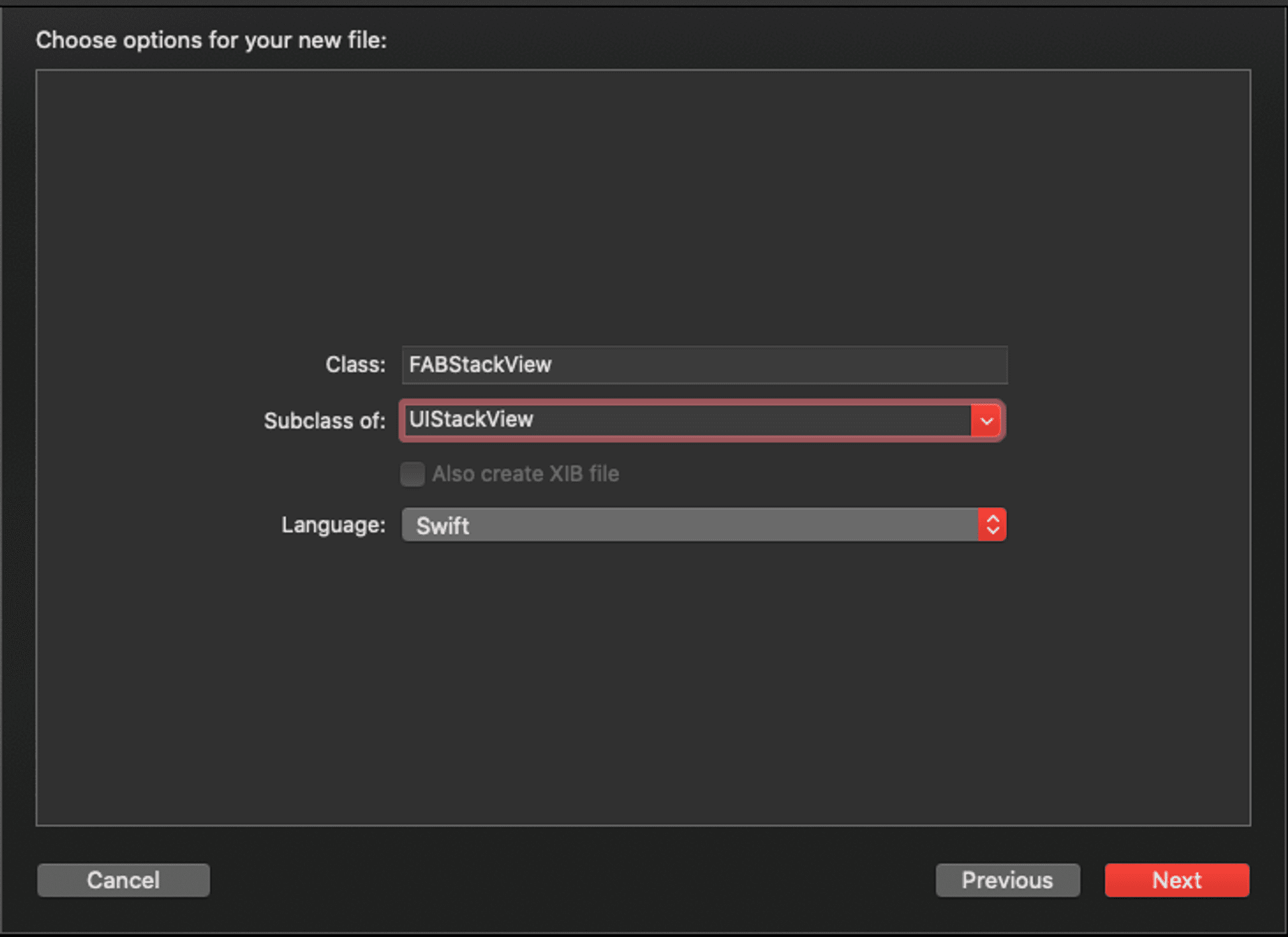
- When the options window for the new file appears (Choose options for your new file: ), we indicate the name of the FABStackView file, which will be a subclass of UIStackView:
By default, the code that appears in this class is:
import UIKit

class FABStackView: UIStackView {

    /*
    // Only override draw() if you perform custom drawing.
    // An empty implementation adversely affects performance during animation.
    override func draw(_ rect: CGRect) {
        // Drawing code
    }
    */

}
First we add the initializer and configuration of the UIStackView component:
override init(frame: CGRect) {
    super.init(frame: frame)
    configureStackView()
}


required init(coder: NSCoder) {
    fatalError("init(coder:) has not been implemented")
}


private func configureStackView() {
    translatesAutoresizingMaskIntoConstraints = false
    distribution = .fill
    axis = .vertical
    alignment = .trailing
    spacing = 12
    clipsToBounds = true
}
Basically, what we do is say that the elements that we introduce in this component will be placed vertically, aligned to the right and with a separation of 12.
To add secondary buttons we will add two methods: the first will add a button and the second will configure them all in the view. We will place these two methods in an extension to structure the code:
// We define an array at the beginning that will be the one that contains each one
// of the secondary buttons that we add.
private var fabSecondaryButtons: [FABSecondary] = [FABSecondary]()

extension FABStackView {
    func addSecondaryButtonWith(image: UIImage, labelTitle: String, action: @escaping () -> ()) {
        let component: FABSecondary
        component.image = image
        component.title = labelTitle
        component.action = action
        fabSecondaryButtons.append(component)
    }


    func setFABButton() {
        configureSecondaryButtons()
    }
}
Since we will make animations to add and remove buttons, we will keep two lists (arrays) with these buttons: the one that contains the added buttons and that is not modified later (secondaryViews), and the one that contains a copy of these buttons to add or delete them. and generate the animation (secondaryButtons):
private var secondaryButtons: [UIView] = [UIView]()
private var secondaryViews: [UIView] = [UIView]()


private func configureSecondaryButtons() {
    for secondary in fabSecondaryButtons {
        let secondaryView = FABSecondaryButton(fabSecondary: secondary)
        secondaryView.delegate = self
        secondaryViews.append(secondaryView)
    }

    setSecondaryButtonsArray()
}


private func setSecondaryButtonsArray() {
    for view in secondaryViews {
        secondaryButtons.append(view)
    }
}
Animation of secondary buttons when appearing and disappearing
To make the presentation and hiding of the secondary buttons a little more attractive, we will add animations both when showing and hiding them.
Presentation of the buttons
The buttons will be presented one by one, and a bounce effect will be sought in said appearance. We will do this by concatenating three animations in a row on the same button:
func showButtons() {
    guard let view = secondaryButtons.last else {
        setSecondaryButtonsArray()
        return
    }

    secondaryButtons.removeLast()

    addArrangedSubview(view)

    NSLayoutConstraint.activate([
        view.leadingAnchor.constraint(equalTo: leadingAnchor),
        view.trailingAnchor.constraint(equalTo: trailingAnchor),
        view.heightAnchor.constraint(equalToConstant: 34)
    ])

    view.transform = CGAffineTransform.identity.scaledBy(x: 0.001, y: 0.001)
    UIView.animate(withDuration: 0.075, animations: {
        view.transform = CGAffineTransform.identity.scaledBy(x: 1.1, y: 1.1)
    }) { finished in
        UIView.animate(withDuration: 0.03, animations: {
            view.transform = CGAffineTransform.identity.scaledBy(x: 0.9, y: 0.9)
        }) { finished in
            UIView.animate(withDuration: 0.03, animations: {
                view.transform = CGAffineTransform.identity
            }) { finished in
                self.showButtons()
            }
        }
    }
}- First, we transform the button and label view with a scale of 0.001.
- The first animation transforms it with a scale of 1.1 in 0.075 seconds. In other words, the button becomes 10% larger than its final size.
- The second animation scales it to 0.9 in 0.03 seconds (90% of its final size).
- Finally, we transform it to its real size in 0.03 seconds.
All this, together, gives a rebound effect on the appearance of the button. In addition, when the final animation is completed, this method is recursively called, so that the buttons are presented one by one (see how at the beginning of the method we use the copy of the buttons to extract and delete them at the same time as the we show).
Hiding the buttons
To hide the buttons we will do something similar to what was previously mentioned for your presentation, but for now we will only use an animation, in which for 0.075 seconds it goes from the original size to a scale of 0.001, and then eliminate the button from the view:
func dismissButtons() {
    guard let view = secondaryButtons.last else {
        setSecondaryButtonsArray()
        return
    }

    secondaryButtons.removeLast()

    UIView.animate(withDuration: 0.075, animations: {
        view.transform = CGAffineTransform.identity.scaledBy(x: 0.001, y: 0.001)
    }) { finished in
        view.removeFromSuperview()
        self.dismissButtons()
    }
}
Adoption of the FABSecondaryButtonDelegate protocol
Since the secondary buttons pass their action through a delegate and the FABSecondaryButtonDelegate protocol, we have to make the FABStackView class adopt the method of this protocol (we do it using an extension to have the code ordered):
extension FABStackView: FABSecondaryButtonDelegate {
    func secondaryActionForButton(_ action: @escaping () -> ()) {
        delegate?.secondaryActionForButton(action)
        dismissButtons()
    }
}
That is, when we click on a secondary button, this method will be executed. Two steps are taken at this point:
- The action is first passed through a delegate to the class that has instantiated FABStackView (that is, the main FABView class). To do this, at the beginning of the FABStackView class we have to add a protocol delegate:
weak var delegate: FABSecondaryButtonDelegate?- Second, we call the dismissButtons method, so that the secondary buttons are hidden.
In a simplified way (in the methods), the code of this class is as follows:
import UIKit


class FABStackView: UIStackView {

    private var fabSecondaryButtons: [FABSecondary] = [FABSecondary]()
    private var secondaryButtons: [UIView] = [UIView]()
    private var secondaryViews: [UIView] = [UIView]()

    weak var delegate: FABSecondaryButtonDelegate?

    override init(frame: CGRect) {
        ...
    }


    required init(coder: NSCoder) {
        ...
    }


    private func configureStackView() {
        ...
    }


    private func configureSecondaryButtons() {
        ...
    }


    private func setSecondaryButtonsArray() {
        ...
    }
}


// MARK: - Public methods
extension FABStackView {
    func addSecondaryButtonWith(image: UIImage, labelTitle: String, action: @escaping () -> ()) {
        ...
    }


    func setFABButton() {
        ...
    }


    func showButtons() {
        ...
    }


    func dismissButtons() {
        ...
    }
}


extension FABStackView: FABSecondaryButtonDelegate {
    func secondaryActionForButton(_ action: @escaping () -> ()) {
        ...
    }
}
To finish, we have to make the FABView class also adopt the FABSecondaryButtonDelegate protocol, so that it can execute pass the action of the right button that is selected:
extension FABView: FABSecondaryButtonDelegate {
    public func secondaryActionForButton(_ action: @escaping () -> ()) {
        isMenuOnScreen.toggle()
        delegate?.secondaryActionForButton(action)
    }
}
Now we simply have to upload all the code entered to a repository (in this case, GitHub) so that it is available to be used as a dependency in any application.
How to import the Floating Action Button into a project
To import the Swift package that contains the Floating Action Button, the first thing we do is create a new project in Xcode.
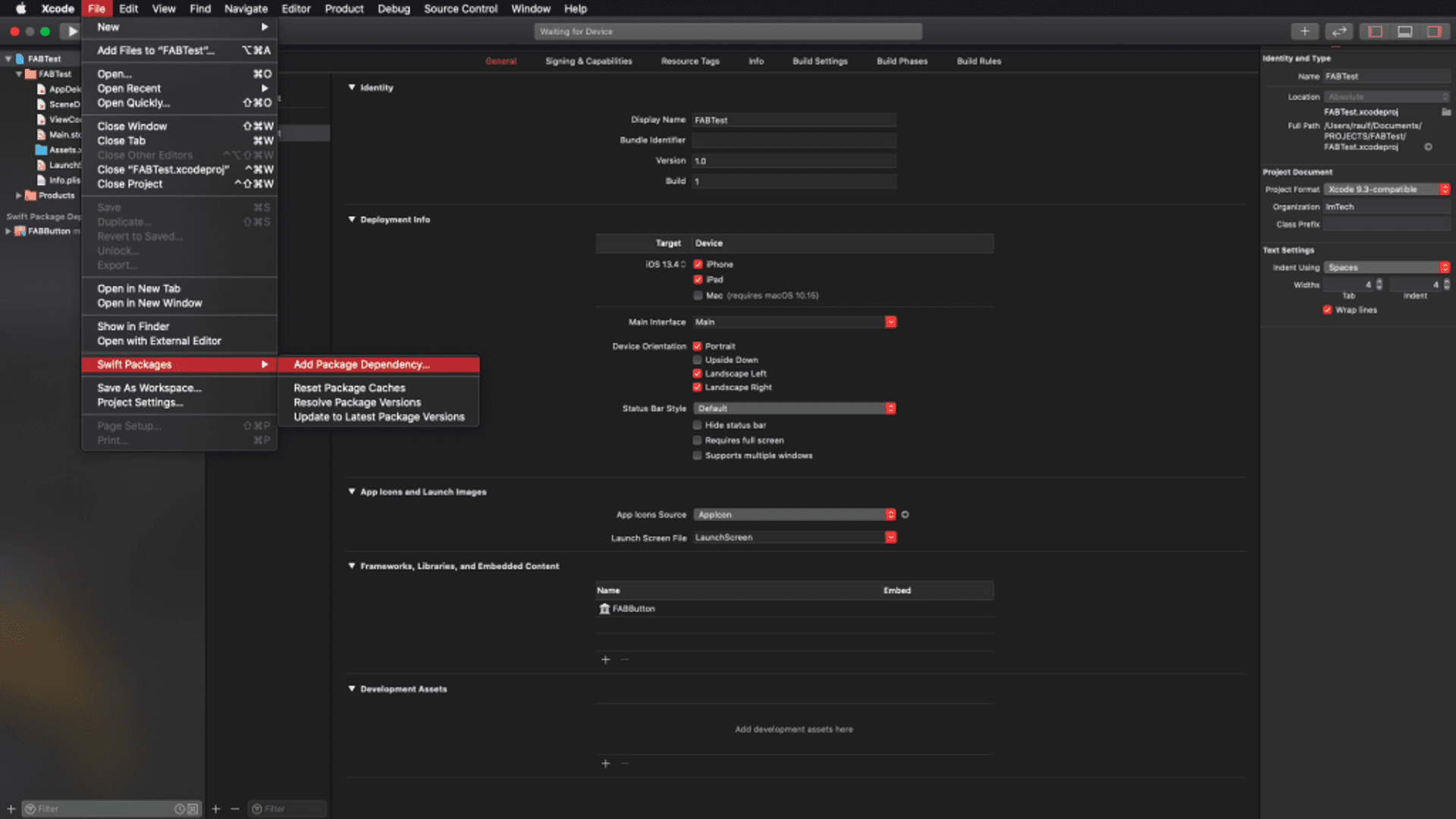
Once created, we go to the menu of Xcode File > Swift Packages > Add Package Dependency…
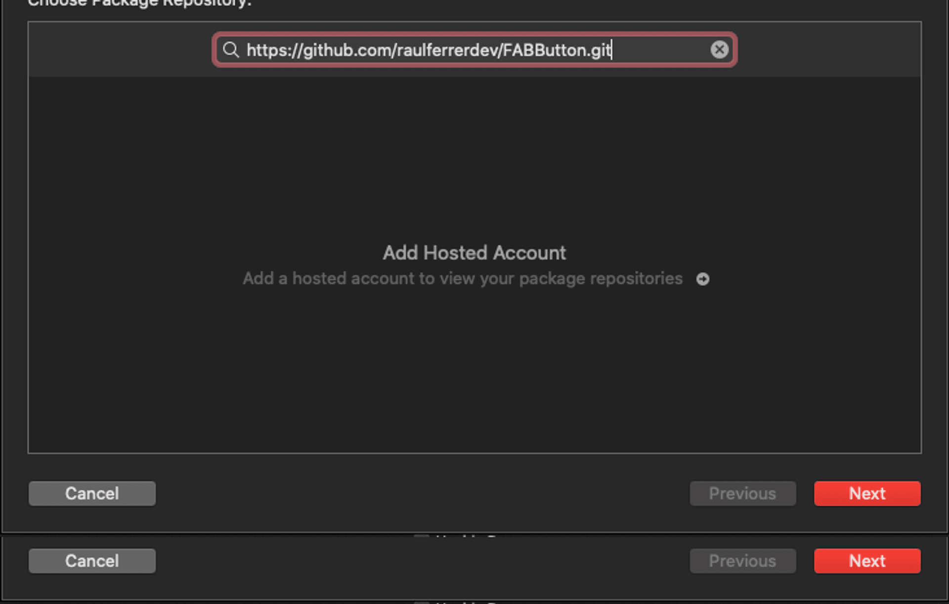
Then we indicate the URL of the Swift package:
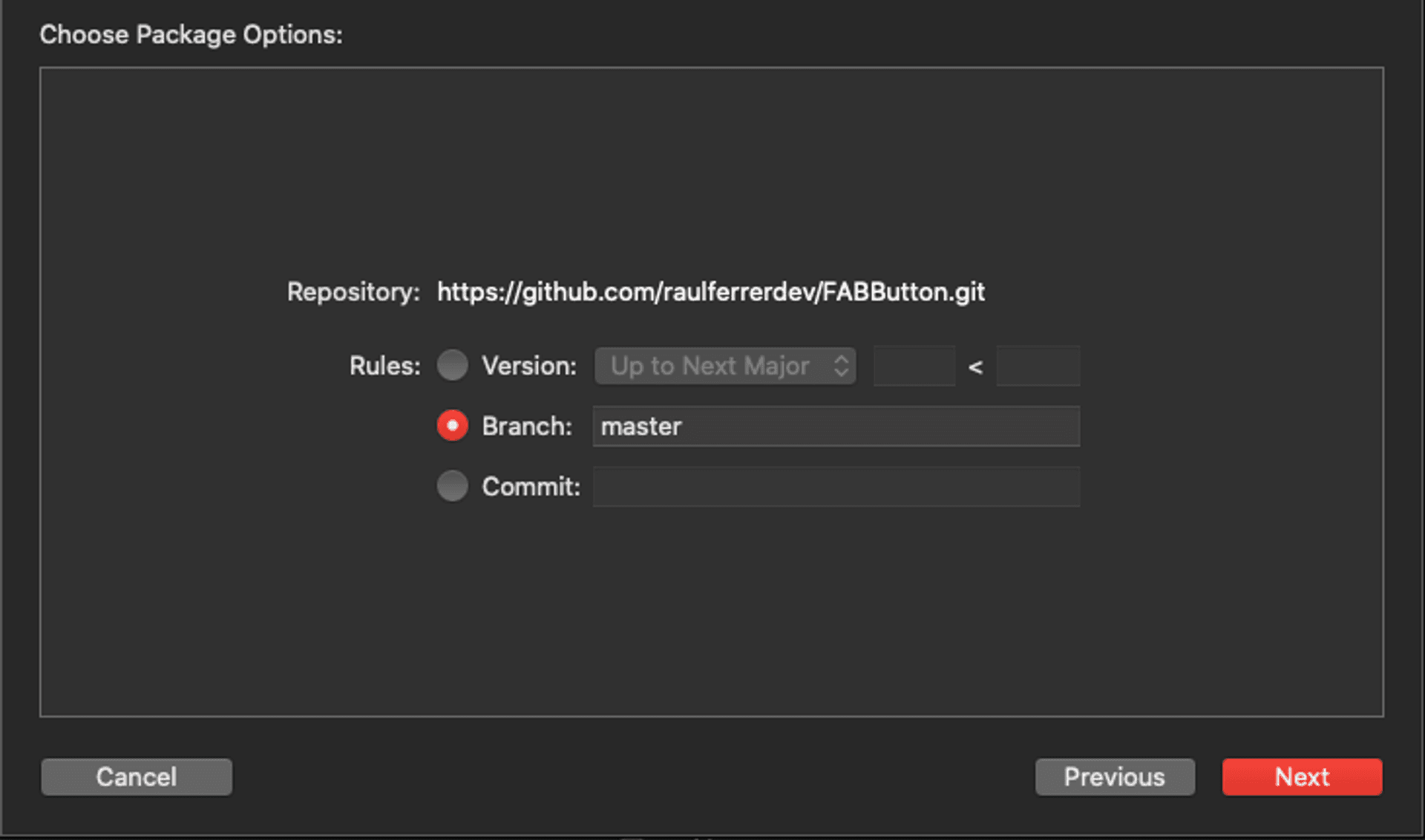
And we indicate the version or branch that we want to add:
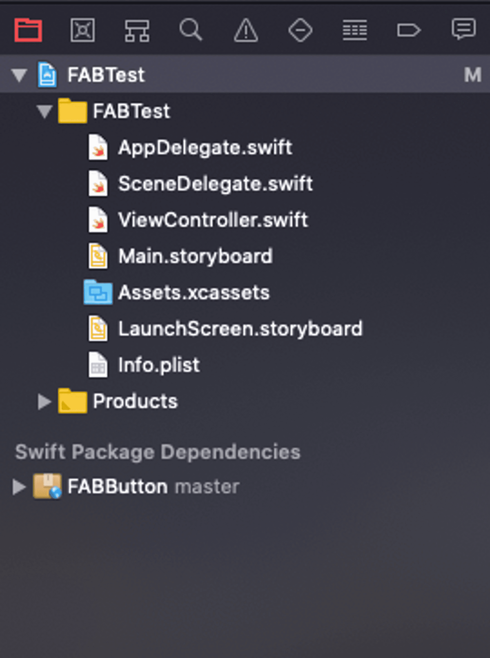
Once added, in the navigation menu we can see the already imported package:
Now, in the ViewController class we only need to import the component, configure the view and add the buttons. For example, the following code shows a button with four secondary buttons:
import UIKit
import FABButton

class ViewController: UIViewController {

    // Create main container, with the main button image
    private let container = FABView(buttonImage: UIImage(named: "shared"))

    override func viewDidLoad() {
        super.viewDidLoad()

        configure()
    }


    override func viewDidAppear(_ animated: Bool) {
        super.viewDidAppear(animated)
        // Set FABButton delegate
        container.delegate = self

        // Add secondary buttons
        container.addSecondaryButtonWith(image: UIImage(named: "twitter")!, labelTitle: "Twitter", action: {
            print("Twitter")
        })
        container.addSecondaryButtonWith(image: UIImage(named: "linkedin")!, labelTitle: "Linkedin", action: {
            print("Linkedin")
        })
        container.addSecondaryButtonWith(image: UIImage(named: "instagram")!, labelTitle: "Instagram", action: {
            print("Instagram")
        })
        container.addSecondaryButtonWith(image: UIImage(named: "facebook")!, labelTitle: "Facebook", action: {
            print("Facebook")
        })
        container.setFABButton()
    }


    private func configure() {
        view.backgroundColor = .white
        view.addSubview(container)
        NSLayoutConstraint.activate([
            container.trailingAnchor.constraint(equalTo: view.trailingAnchor, constant: -20),
            container.bottomAnchor.constraint(equalTo: view.bottomAnchor, constant: -20)
        ])
    }
}

// Add FABSecondaryButtonDelegate delegate methods
extension ViewController: FABSecondaryButtonDelegate {
    func secondaryActionForButton(_ action: FABSecondaryAction) {
        action()
    }
}
If we now run this application, we can check the operation of the Floating Action Button.
Conclusion
In this article we have seen how to create a Floating Action Button that displays a secondary menu and, in addition, create it as a Swift package to be able to upload it to the repository and share it with other projects. Since Floating Action Button****Floating Action Button has been incorporated into Xcode 11, this process has become much easier.
