After having seen in previous posts some of the basic components of SwiftUI: VStack, HStack, ZStack, Image, Text, Button… now, what we are going to do is put them all together in a practical example to create a more complex interface.
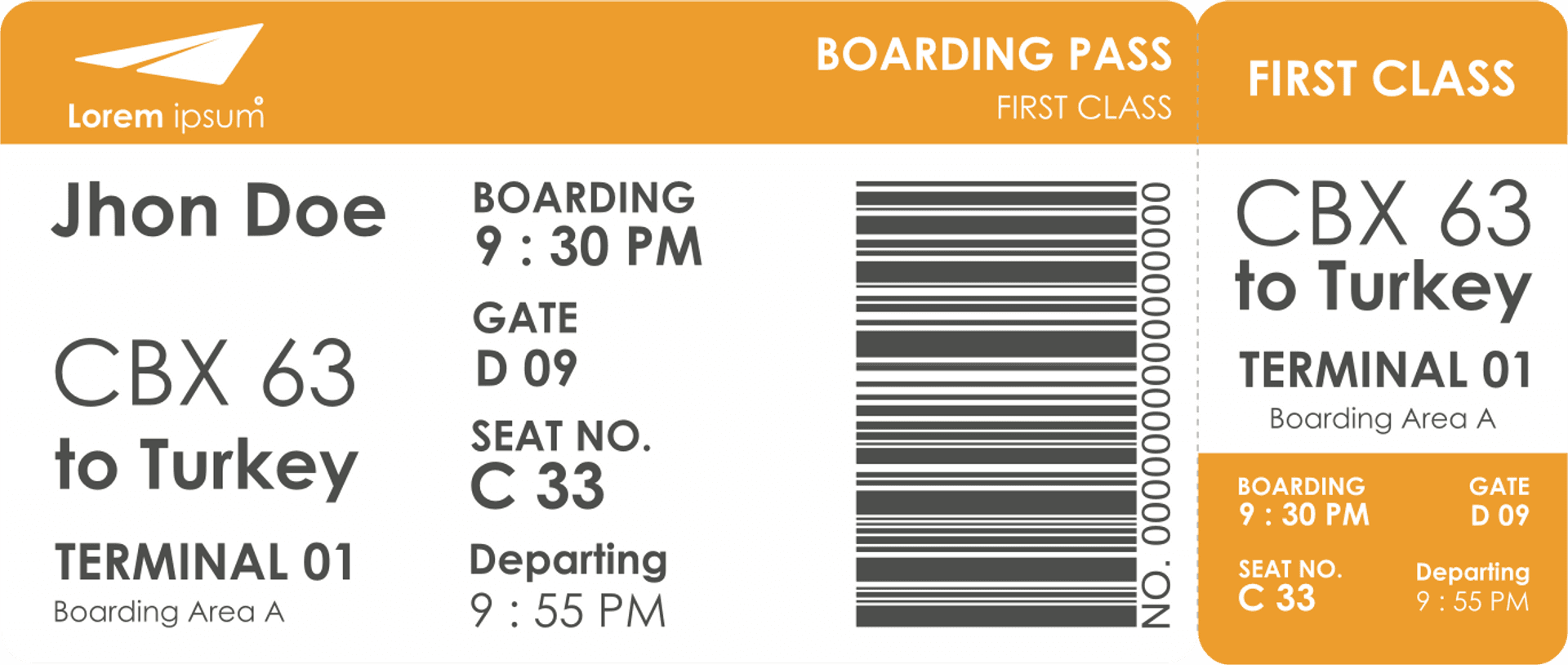
In this case, we have chosen a plane boarding pass.
Once we know the user interface that we have to compose, we can choose different assembly strategies, but in the end, basically, they will all be reduced to nesting VStack, HStack and ZStack, with image and text components inside.
Componentes strucuture
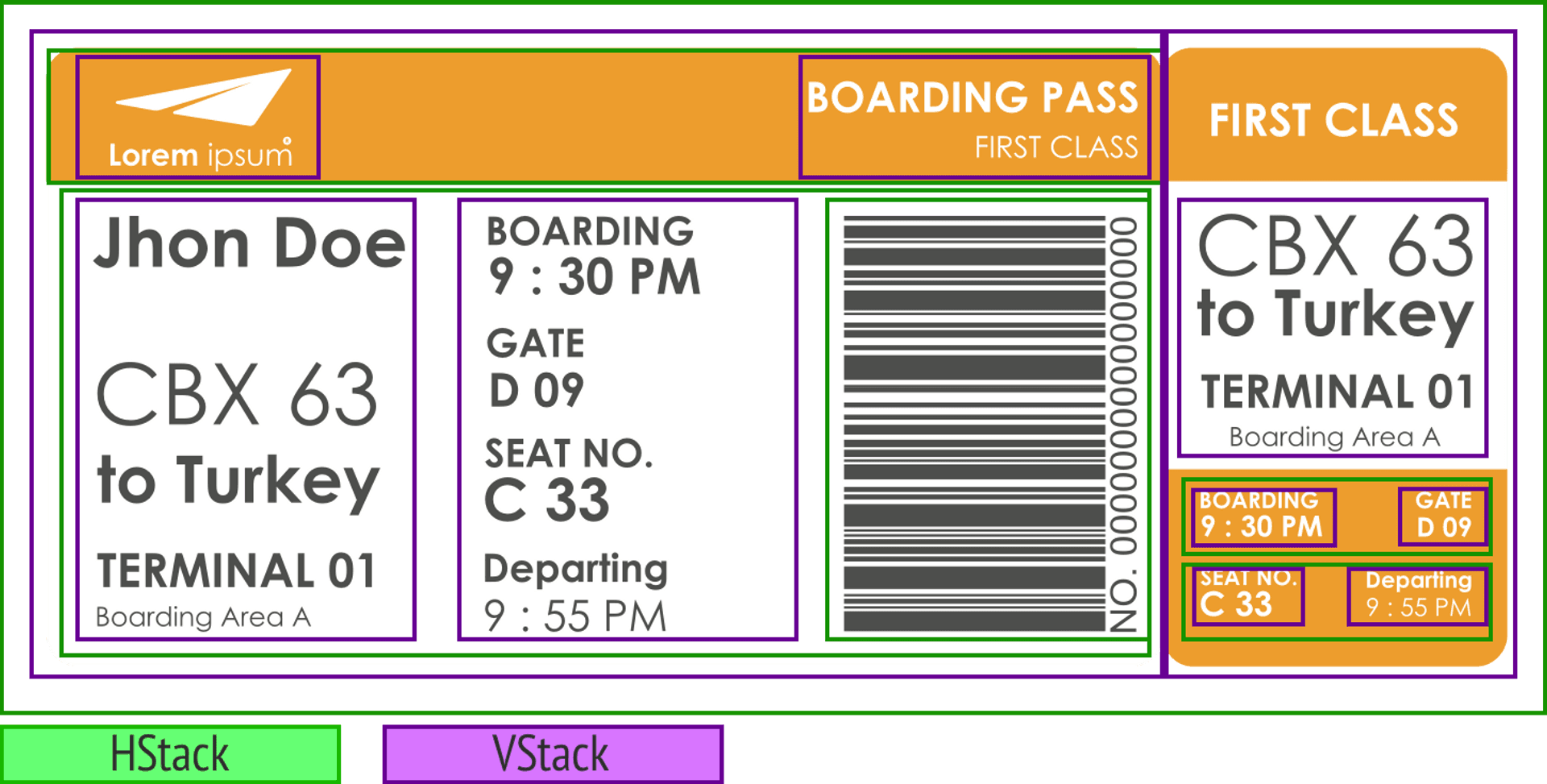
The following image shows how the interface is structured with SwiftUI. The green boxes show VStack type structures, while the purple ones show HStack type structures. Inside, we basically find a couple of Image components and the rest are all Text components.
Text and color custom components
We are now going to make some custom components that will facilitate the development of the interface.
Custom colors
The first of them will be to introduce the two colors that we can see that, along with white, appear in the interface: one orange and the other gray. What we will do is take these colors and create them in the Assets, and then introduce them into the application code.
extension Color {
    static let grayText = Color("grayText")
    static let orangeBar = Color("orangeBar")
}
Where grayText and orangeBar are the names we have assigned to those colors in Assets.
Custom text
In the case of the text, we see that it is the same font (in our case we will use the system one), and that only its size, weight and color change. Therefore, we can create a component (CustomText) to which we will pass those values together with the text, which will allow us to simplify the code of the view.
struct CustomText: View {
    var color: Color
    var size: CGFloat
    var text: String
    var weight: Font.Weight

    var body: some View {
        Text(text)
            .fontWeight(weight)
            .font(.system(size: size))
            .foregroundColor(color)
    }
}
User Interface development
To better organize the code, each of the parts that make up this interface will be created as variables and then we will include them all in the body. Thus, the body of the application would have the following form:
struct ContentView: View {
    var body: some View {
        HStack(spacing: 0) {
            VStack {
                topLeftBar
                HStack {
                    nameView
                    flightInfoView
                    codeBar
                }
            }
            VStack {
                topRightBar
                cardNameView
                cardFlightInfoView
            }
        }
    }
}
Where topLeftBar, nameView, flightInfoView, codeBar, topRightBar, cardNameView, and cardFlightInfoView are the diferent parts of the UI.
topLeftBar
This component is basically an orange stripe. Is an HStack with a VStack (with an image and a text) on the left, and a VStack with two texts on the right. The space between is achieved with a Spacer.
var topLeftBar: some View {
    HStack {
        VStack(spacing: 0) {
            Image("plane").resizable()
                .aspectRatio(contentMode: .fit)
                .frame(width: 82, height: 27)
            HStack(spacing: 2) {
                CustomText(color: .white, size: 14, text: "Lorem", weight: .bold)
                CustomText(color: .white, size: 14, text: "Ipsum", weight: .light)
            }
        }
        .padding(.leading, 30)
        Spacer()
        VStack(alignment: .trailing) {
            CustomText(color: .white, size: 20, text: "BOARDING PASS", weight: .bold)
            CustomText(color: .white, size: 14, text: "FIRST CLASS", weight: .light)
        }
        .padding(.trailing,10)
    }
    .frame(minWidth: 0, maxWidth: .infinity, minHeight: 62, maxHeight: 62)
    .background(Color.orangeBar)
}
nameView
This component, positioned at the left side, is a VStack with several CustomText components inside (contains the passenger and flight info):
var nameView: some View {
    VStack(alignment: .leading) {
        CustomText(color: .grayText, size: 30, text: "Jhon Doe", weight: .bold)
        Spacer(minLength: 30)
        CustomText(color: .grayText, size: 40, text: "CBX 63", weight: .light)
        CustomText(color: .grayText, size: 30, text: "to Turkey", weight: .bold)
        Spacer(minLength: 10)
        CustomText(color: .grayText, size: 20, text: "TERMINAL 01", weight: .bold)
        CustomText(color: .grayText, size: 14, text: "Boarding Area A", weight: .light)
    }.padding(.vertical, 10)
}
flightInfoView
This component, positioned at the middle, is a VStack with several CustomText components inside (contains the departure flight info). We have used Group in order to allow the VStack to hold more than 10 elements inside:
var flightInfoView: some View {
    VStack(alignment: .leading) {
        Group {
            CustomText(color: .grayText, size: 18, text: "BOARDING", weight: .bold)
            CustomText(color: .grayText, size: 22, text: "9 : 30 PM", weight: .bold)
        }
        Spacer()
        Group {
            CustomText(color: .grayText, size: 18, text: "GATE", weight: .bold)
            CustomText(color: .grayText, size: 18, text: "D 09", weight: .bold)
        }
        Spacer()
        Group {
            CustomText(color: .grayText, size: 18, text: "SEAT NO.", weight: .bold)
            CustomText(color: .grayText, size: 24, text: "C 33.", weight: .bold)
        }
        Spacer()
        Group {
            CustomText(color: .grayText, size: 18, text: "Departing", weight: .bold)
            CustomText(color: .grayText, size: 22, text: "9 : 55 PM", weight: .light)
        }
    }
}
codeBar
This is the barcode for the Boarding pass. Is an HStack with an Image and a CustomText. The CustomText has been rotated -90º to put it vertically:
var codeBar: some View {
    HStack {
        Image("codebar")
            .resizable()
            .frame(width: 122)
        CustomText(color: .grayText, size: 18, text: "NO. 0000000000000000", weight: .light)
            .rotationEffect(.degrees(-90))
            .fixedSize()
            .frame(width: 20, height: 180)
    }
    .padding(.vertical, 5)
}
topRightBar
This component is as simple as a CustomText with backgorund color.
var topRightBar: some View {
    CustomText(color: .white, size: 20, text: "FIRST CLASS", weight: .bold)
        .frame(minWidth: 0, maxWidth: .infinity, minHeight: 62, maxHeight: 62)
        .background(Color.orangeBar)
}
cardNameView
This component, positioned at the left side, is a VStack with several CustomText components inside (contains the flight info):
var cardNameView: some View {
    VStack(alignment: .center, spacing: 0) {
        CustomText(color: .grayText, size: 38, text: "CBX 63", weight: .light)
            .frame(height: 32)
        CustomText(color: .grayText, size: 28, text: "to Turkey", weight: .bold)
            .frame(height: 30)
        Spacer(minLength: 10)
        CustomText(color: .grayText, size: 18, text: "TERMINAL 01", weight: .bold)
        CustomText(color: .grayText, size: 12, text: "Boarding Area A", weight: .light)
    }
}
cardFlightInfoView
This component is somewhat more complex since it is made up of various HStack and VStack nested inside which there is a series of CustomText elements.
var cardFlightInfoView: some View {
    VStack {
        HStack {
            VStack(alignment: .leading) {
                CustomText(color: .white, size: 10, text: "BOARDING", weight: .bold)
                CustomText(color: .white, size: 14, text: "9 : 30 PM", weight: .bold)
            }
            Spacer()
            VStack(alignment: .leading) {
                CustomText(color: .white, size: 10, text: "GATE", weight: .bold)
                CustomText(color: .white, size: 12, text: "D 09", weight: .bold)
            }
        }
        Spacer()
        HStack {
            VStack(alignment: .leading) {
                CustomText(color: .white, size: 10, text: "SEAT NO.", weight: .bold)
                CustomText(color: .white, size: 16, text: "C 33", weight: .bold)
            }
            Spacer()
            VStack(alignment: .leading) {
                CustomText(color: .white, size: 10, text: "Departing", weight: .bold)
                CustomText(color: .white, size: 12, text: "9 : 55 PM", weight: .light)
            }
        }
    }
    .padding(.init(top: 10, leading: 20, bottom: 25, trailing: 20))
    .frame(width: 162, height: 100)
    .background(Color.orangeBar)
}
UI adjustment
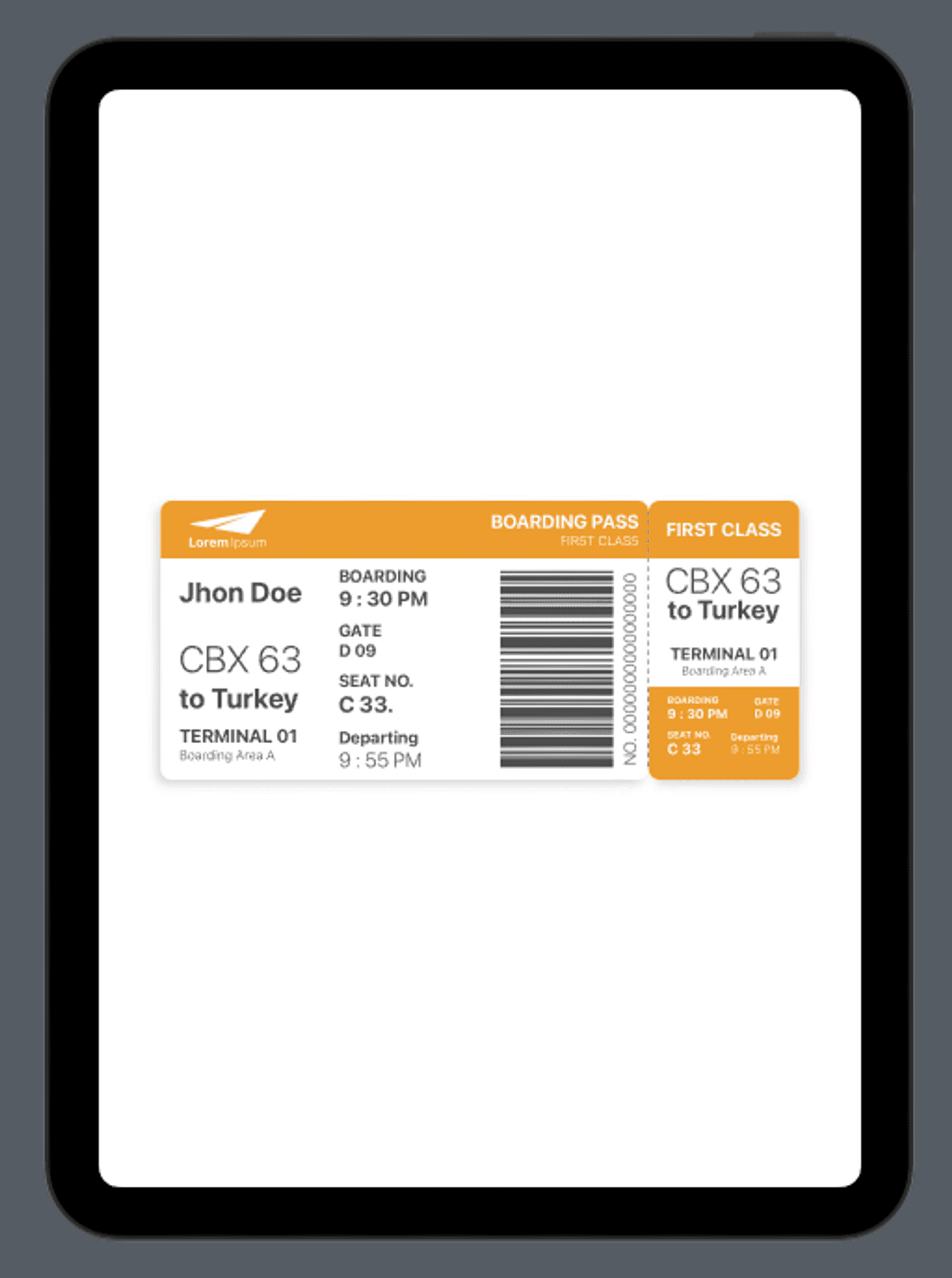
Once we have created the different parts of the interface and we have inserted them into the body, the only thing left to do is adjust the spacing between these components so that they resemble the sample design as much as possible:
struct ContentView: View {
    var body: some View {
        HStack(spacing: 0) {
            VStack {
                topLeftBar
                HStack {
                    nameView
                    Spacer()
                    flightInfoView
                    Spacer()
                    Spacer()
                    codeBar
                }
                .padding(.leading, 20)
                .padding(.trailing, 10)
                Spacer()
            }
            .frame(width: 525, height: 300)
            .background(.white)
            .cornerRadius(12)
            .shadow(color: Color.black.opacity(0.15), radius: 5, x: -5, y: 5)
            .overlay(
                HStack {
                    Spacer()
                    Rectangle()
                        .stroke(Color.gray, style: StrokeStyle(lineWidth: 1, dash: [5]))
                        .frame(width: 1, height: .infinity).padding(.vertical, 12)
                }
            )
            VStack {
                topRightBar
                cardNameView
                cardFlightInfoView
            }
            .frame(width: 162, height: 300)
            .background(.white)
            .cornerRadius(12)
            .shadow(color: Color.black.opacity(0.15), radius: 5, x: 5, y: 5)

        }
    }
}
Conclusion
SwiftUI might make it difficult to create complex user interfaces, but with the right use of the containers and views provided by the framework, complex designs can be built with ease.


